A clearer path to support and engagement.
Their existing website was awash with broken links, a complicated user journey and a lack of key content that made it hard for users to engage, making it challenging for the charity to deliver the impact they were striving for.
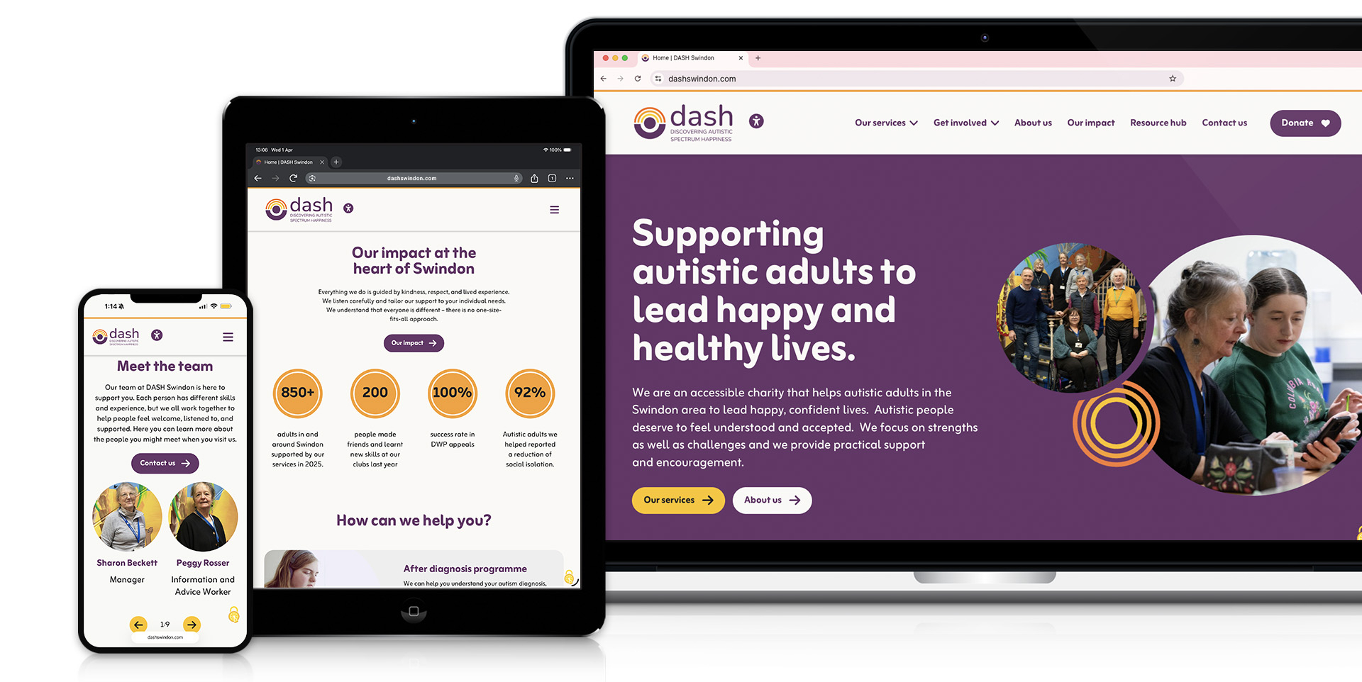
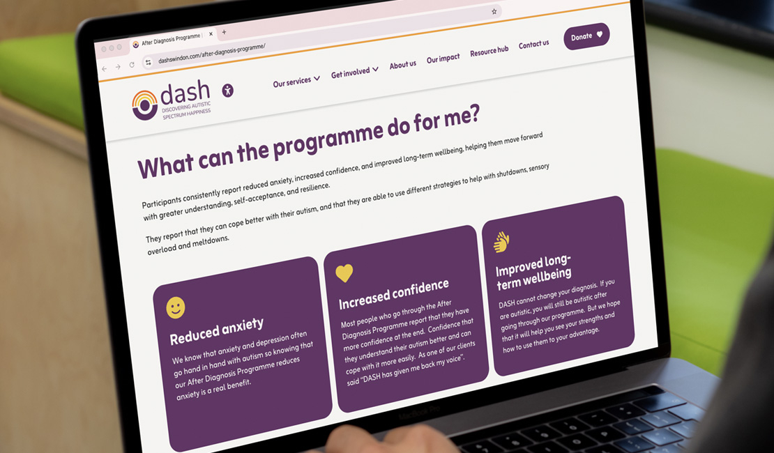
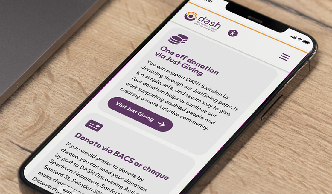
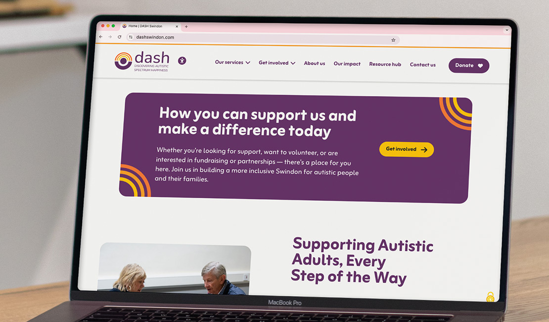
Through a detailed and collaborative planning stage, we determined the most effective sitemap and user journey, as well as content areas to display throughout that journey, to aid the process of users finding information as quickly and easily as possible. It was also important that the various ways to support the charity were made more prominent, with clear call to actions - which have been featured throughout the most relevant parts of a user's journey.
During the design stage, we took the opportunity to expand the brand visually to create a friendly and engaging atmosphere when navigating the site, utilising their logo colours to bolden and refresh the website visuals.
The final result is a brilliantly designed WordPress website that functions with ease and has a clear user journey with prioritised call to actions, whilst empowering DASH to easily access and manage their content.